 Richard André, Little Red Riding Hood. 1888
Reading time: 5 to 10 min ∼ Amount of images: A lot.
Hi! Here’s my humble way of speaking fonts, letters and type-related stuff freely.
It will be a wider look at the old/vintage typography through this cool subject…
← Without further a due, let’s talk about Little Red Riding Hood (book covers and more).
· From 1856 to 1899.
 1. W. Momberger. 1856
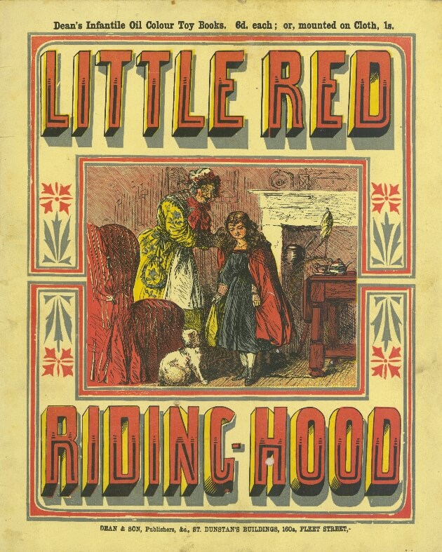 2. Dean and Son. 1873
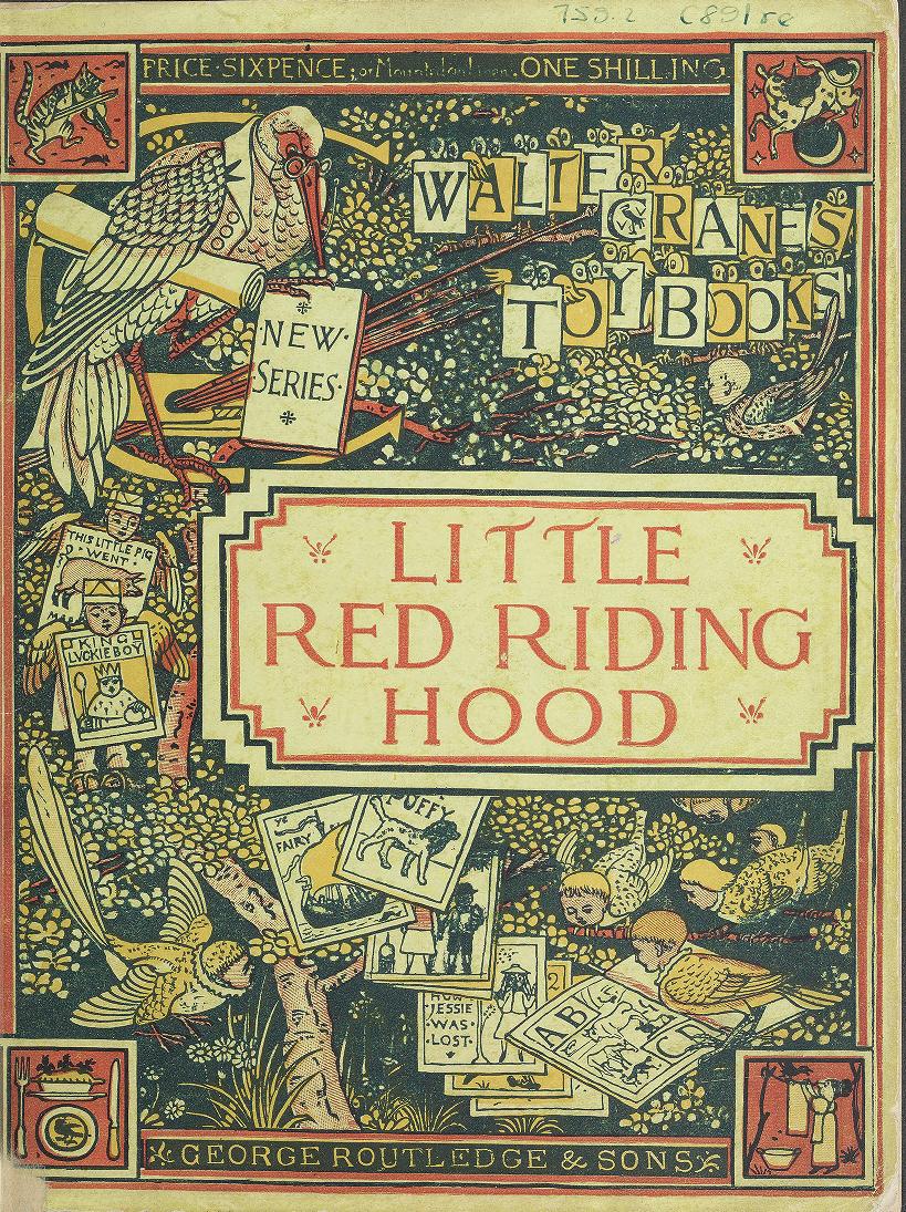 3. Walter Crane. 1875
Our journey starts in 1856 in company of a dripping font and a creepy illustration (Halloween themed?) [1]. Black, red and yellow letters on a flat green background… Poor children.
Then, we have a nice toy book [2] with big extended sans-serif font filled with a black stroke. The whole composition is a little bit dainty because of the decorative elements (frames and flowers) but add uniqueness to the book cover.
After that, we find a beautifully illustrated (by Walter Crane) yet classical interpretation of the Little Red Riding Hood story [3]. The visual is comprehensibly poetic/dreamlike and the letters, surrounded by a sidebar are light and slightly decorated. Do cats play the violin? Yes.
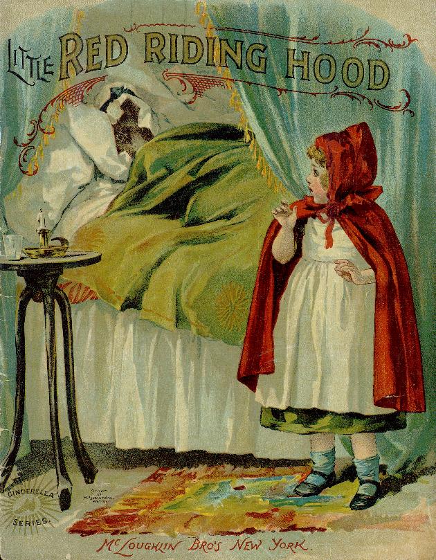
Mc Loughlin Bros 1880’s edition [4] is, in my opinion, one of the finest. The title’s condensed font is singular, pairs well with the other fonts and the delicate white shadows are perfect to have a good readability.
 4. Mc Loughlin Bros. 1880
The fifth cover [5] is a totally different approach. It has big decorated neo-gothic letters and a splendid yet intriguing illustration. I simply just love the frames, shadows and decorative elements who provide a deeper ambiance.
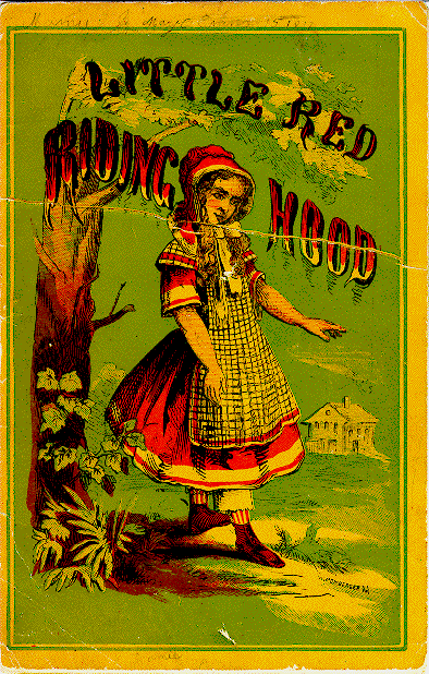
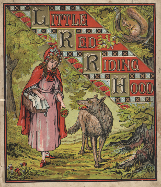
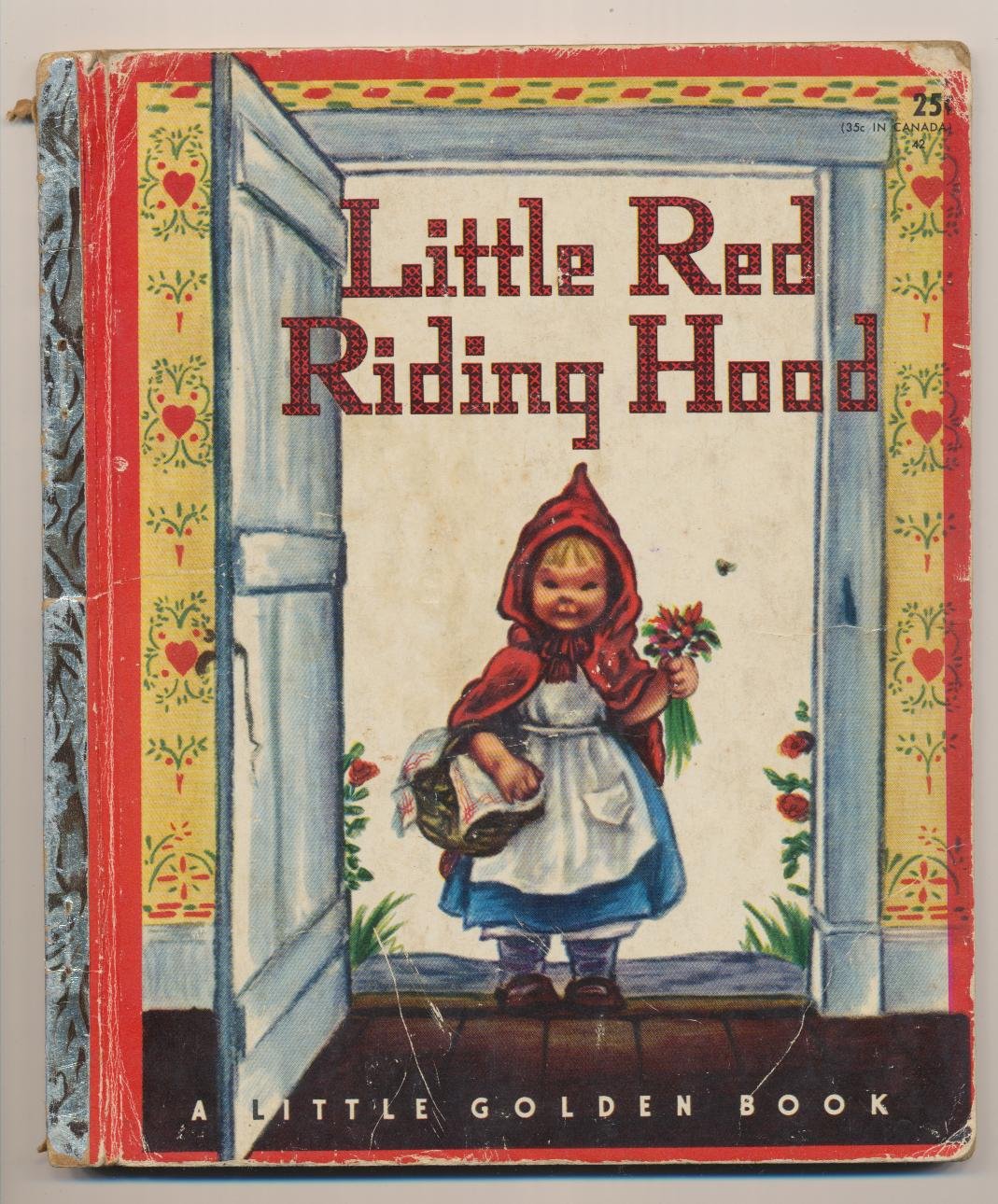
Next book cover illustration was done by Richard André [6], with its crazy twisty signature letters. I like how everything fits awkwardly together.
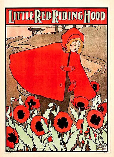
 5. Peter G. Thomson. 1885
 6. Richard André. 1888
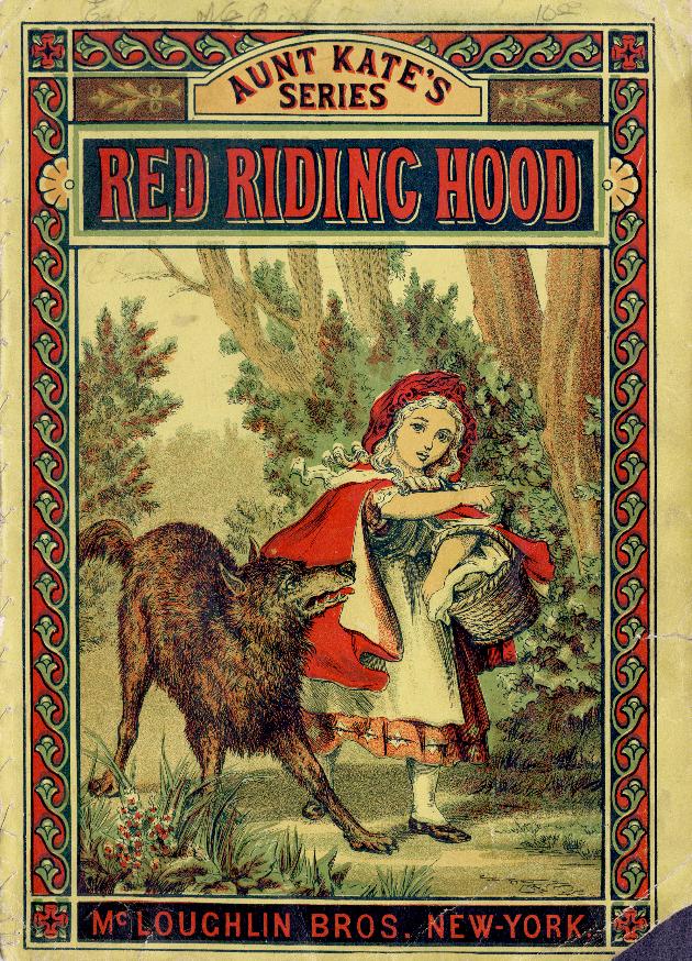
 7. Schultz and Co. 1890s
As the 19th century ends, publishers Schultz and Co. released a tiny advertising booklet for Star Soap picturing the Little Red Riding Hood [7]. The booklet cover fonts are filled with color gradients, I imagine the illustrator(s) might have a little too much fun playing with effects :)
Underneath, you can see two art nouveau paintings by John Hassall having some very interesting ligatures and fragile handmade letters [8,9].
 8. John Hassall. 1898
 9. John Hassall. 1898
 10. McLoughlin Bros. 1899
· 1903 to 1959.
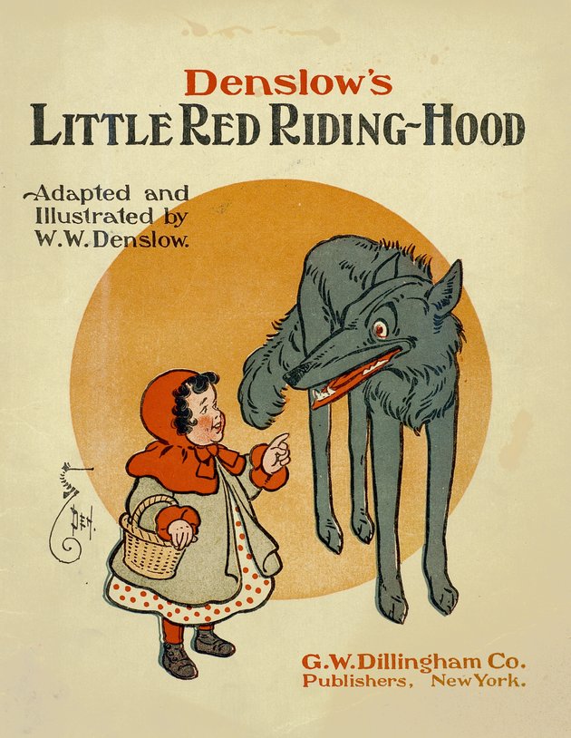 11. W.W. Denslow. 1903
The W.W. Denslow illustrated book [11] has such a cool, timeless typeface. In a book from 1903 nonetheless, you find a great balance between small caps, lowercase and an interesting ‘n’ letter (at the top).
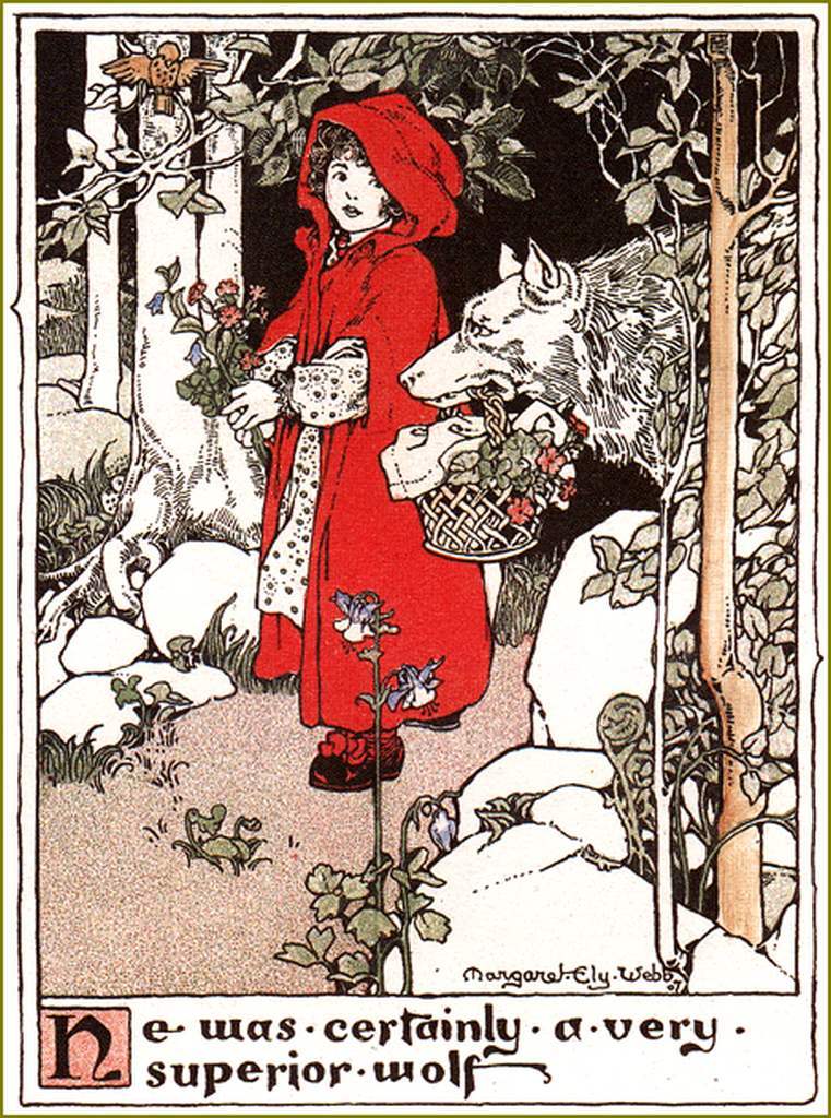 12. Margaret Ely Webb. 1909
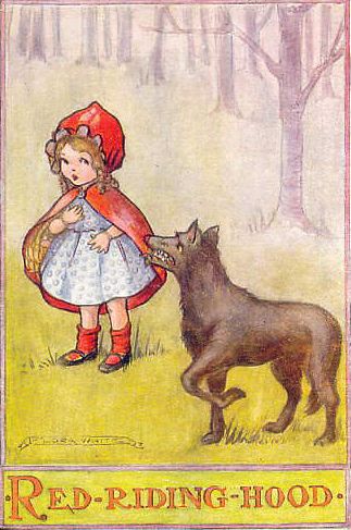 13. Flora White. Postcard. Date unknown
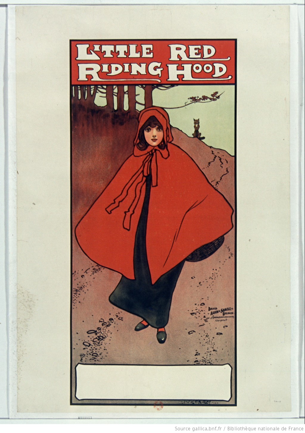
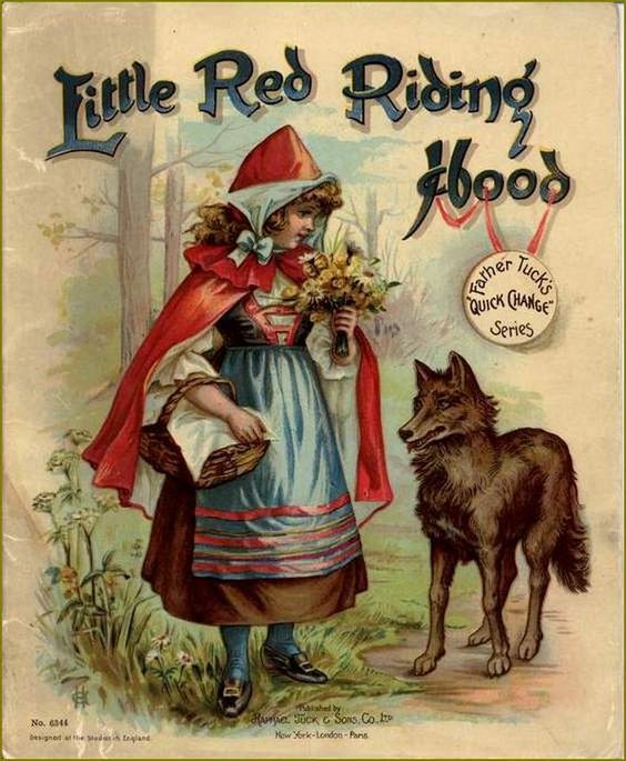 14. Raphael Tuck & Sons, Co. Date unknown
As a proof that fonts can have a strong impact on how we feel about a visual, I present to you a peculiar illustrated Red Riding Hood [12]. On the edge of art nouveau, the author strengthens the badness of the wolf with calligraphic gothic letters. Some of them like the first ‘e’ or ‘f’ seemed inspired by Celtic alphabet (uncial).
The next example is odd and brings many questions [14]. Letters are strangely close to what we’ve seen in old school graffiti: gradients and crazy original shapes (‘L’, ‘R’, ‘d’, ‘g’ and ‘H’). Cool customs.
Remember that time Little Red Riding Hood took acid? [15]
What’s curious here is that the inner-font decorations used by Frances Brundage are usually seen in postcards saying “With Love, From California” (or in psychedelic rock band posters from the 70s). Coincidence?
Next, we can look at an ad poster for a pantomime theater [16]. Not for kids anymore: the “Little” is gone, leaving a sexualized adult Red Riding Hood with bold all caps and sans-serif.
 15. Frances Brundage. 1929
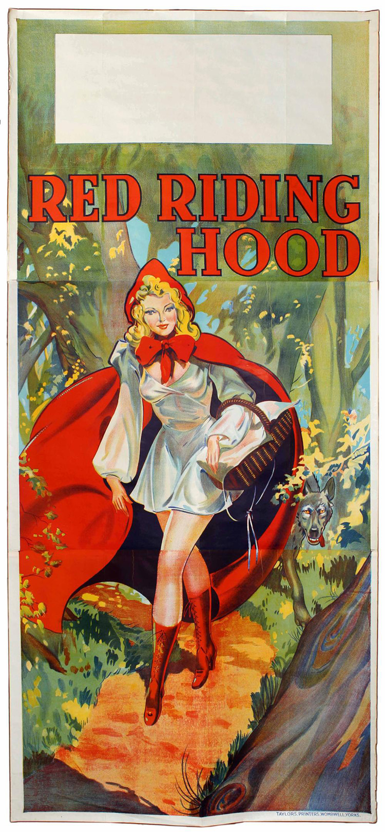 16. Advertising poster for a theater. 1930s
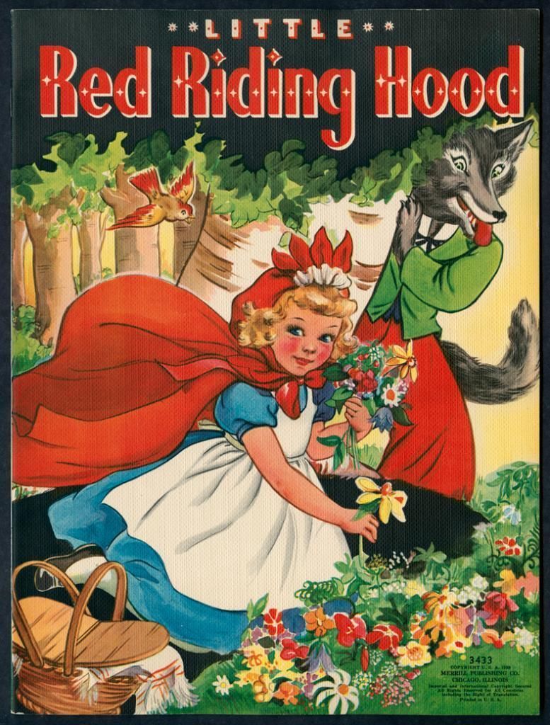 17. Merrill. 1939
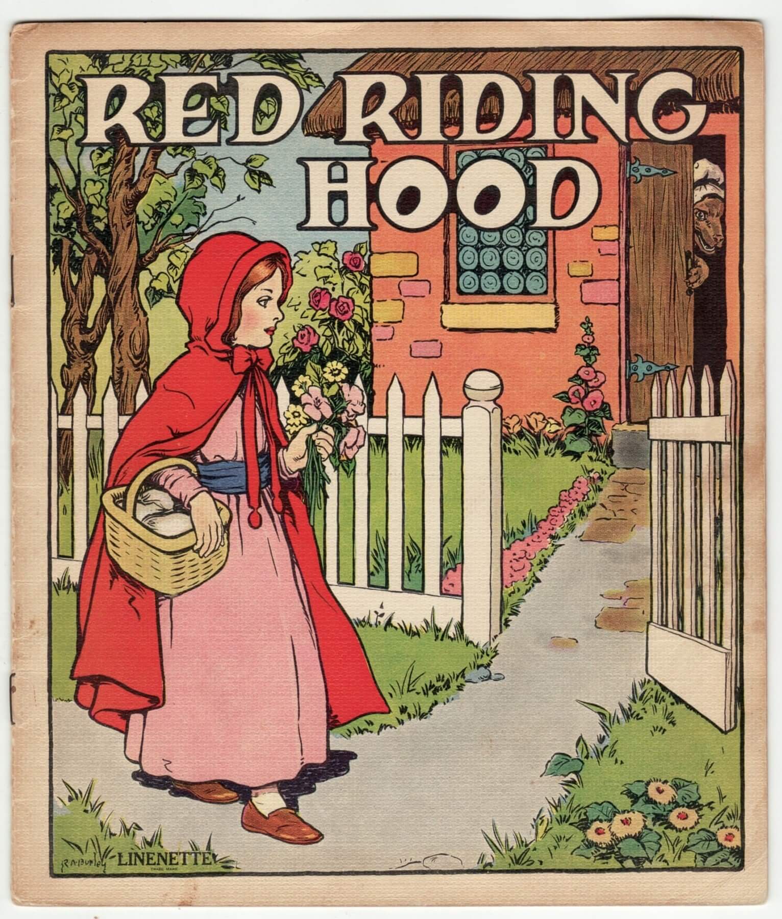 18. R.A. Burley & G. Robinson. 1939
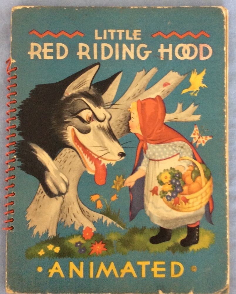 19. Julian Wehr. 1944
What’s relevant here – besides that the two terrific dolls have square letters [20,22] – is another great example of diversity of fonts used as titles. You can see a North-American font lookalike (you’ve seen this in a comic with cowboys and indians) [17], a borrowing at art nouveau style (with ‘o’ like eyes) [18] and a surprisingly modern fantasy sans-serif [19].
 20. Elizabeth Orton Jones, 1948
 21. Dinah. 1950
 22. Audio Creations. 1959
· A European myth.
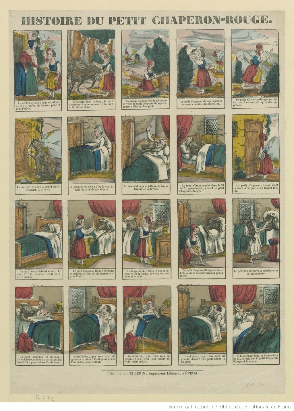 Histoire du Petit Chaperon Rouge, Image d’Épinal. 1843
A tale of oral tradition like the Little Red Riding Hood can be found in a large number of countries. Starting with Charles Perrault in France and Brothers Grimm in Germany, other versions of the story have evolved in time, leaving us plenty of amazing (and sometimes weird) adaptations.
Let’s see how book covers’ titles were done in Europe (France, Netherlands, Germany, Spain and Slovenia).
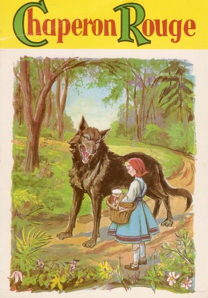
 21. Unknown artist(s) and date.
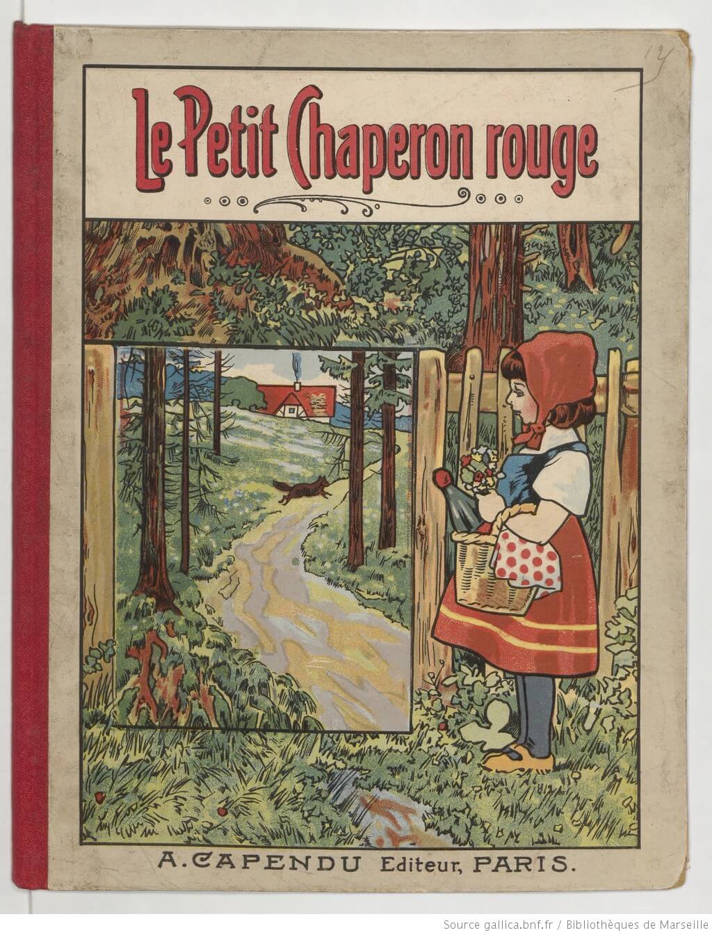 22. A. Capendu. Date unknown
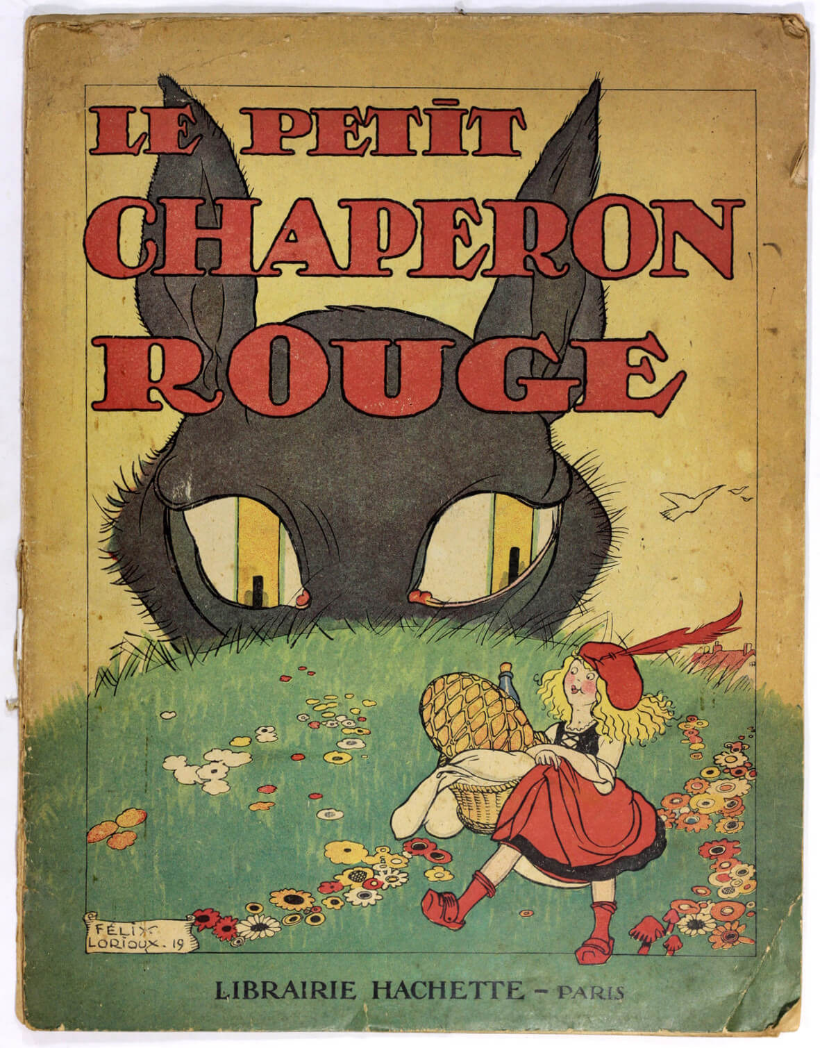 23. Félix Lorioux. 1920
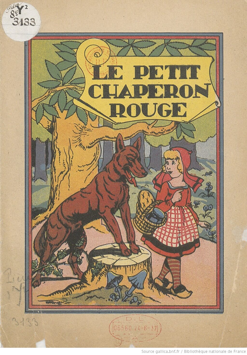 24. Liège. 1936
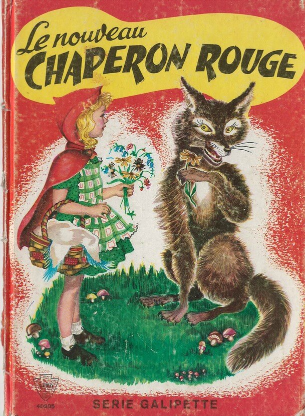
 25. J. Tronchère & L. Tridon. 1951
 26. Lito SA. Date unknown
 27. Unknown artist(s) and date.
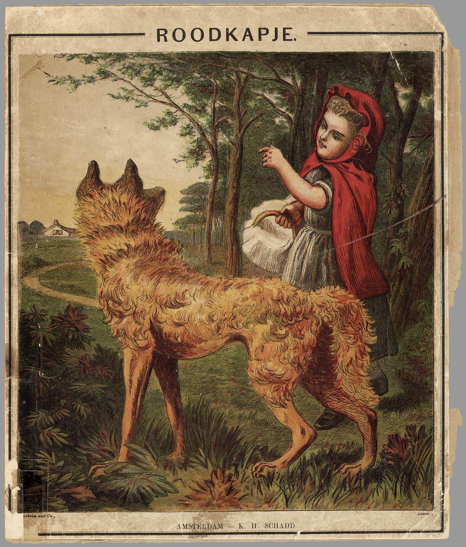 28. K.H. Schadd. 1868
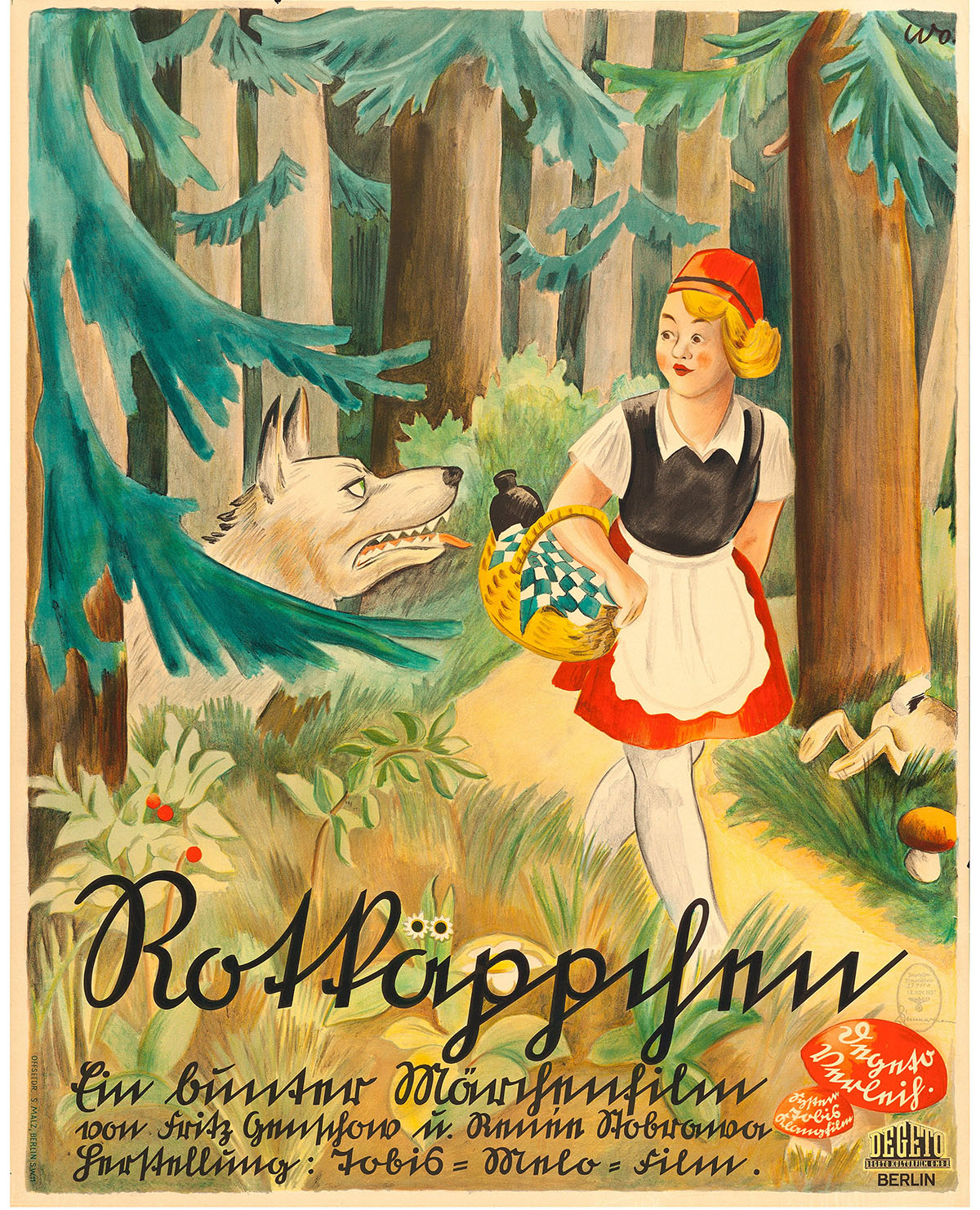 29. Tobis-Melofilm. 1937
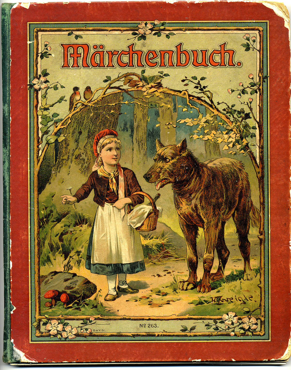 30. G. & V. St. 1919
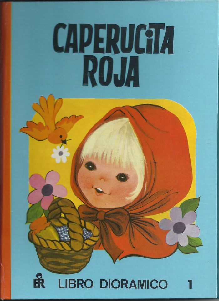 31. Editorial Roma. 1979
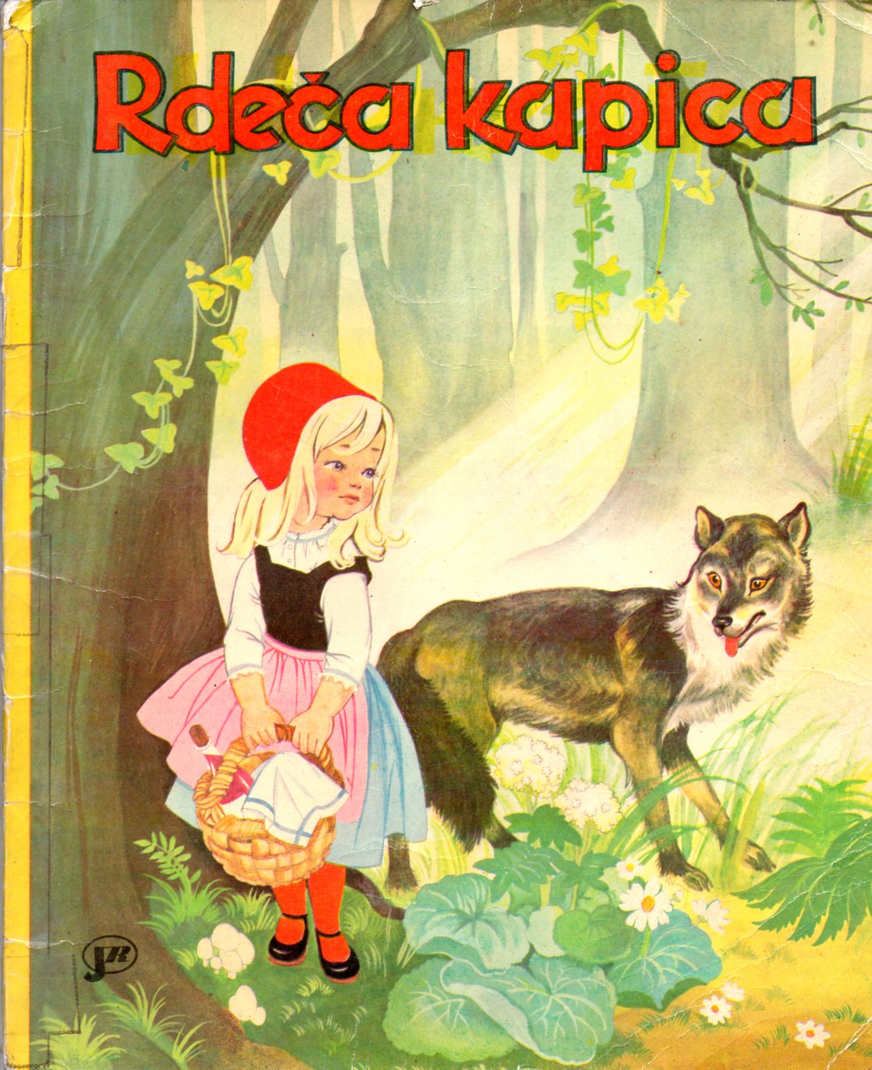 32. Slovenian edition. 1989
· Bonus (stamps and ad-related use).
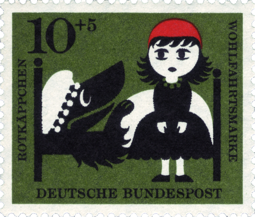
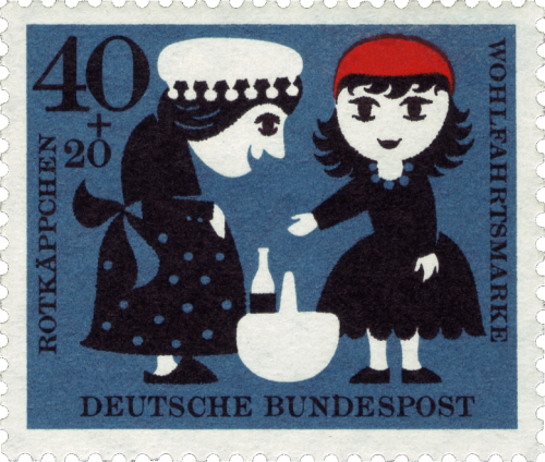 Deutsche Bundespost. 1960
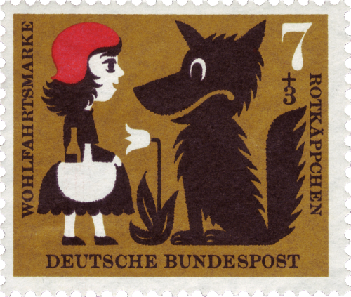

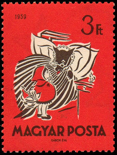 Hungary. 1959
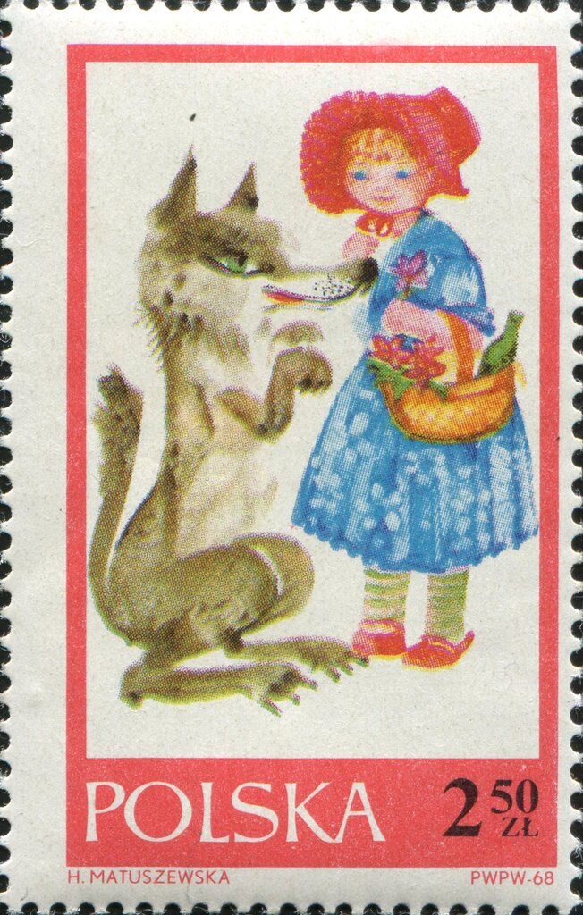 Poland. 1968
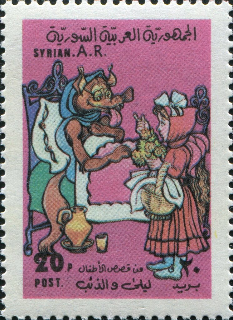 Syria. 1976
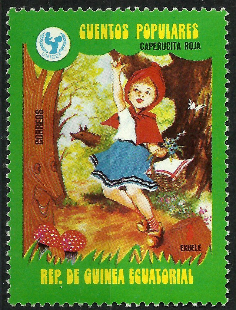 Equatorial Guinea. 1979
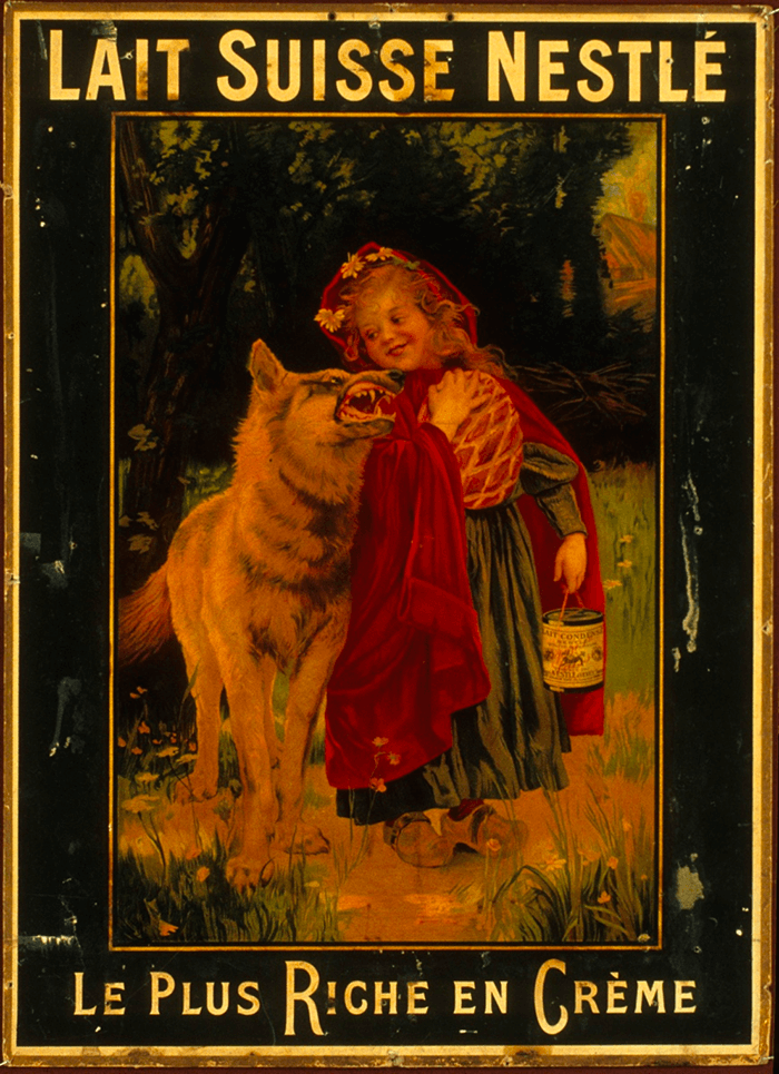 Nestlé. ca 1900
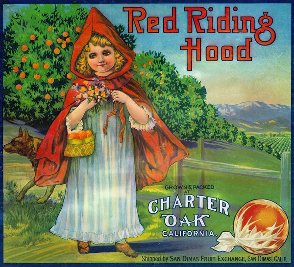 Charter Oak. 1930s
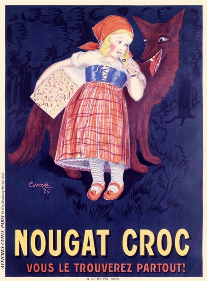 A. Cometti. Date unknown
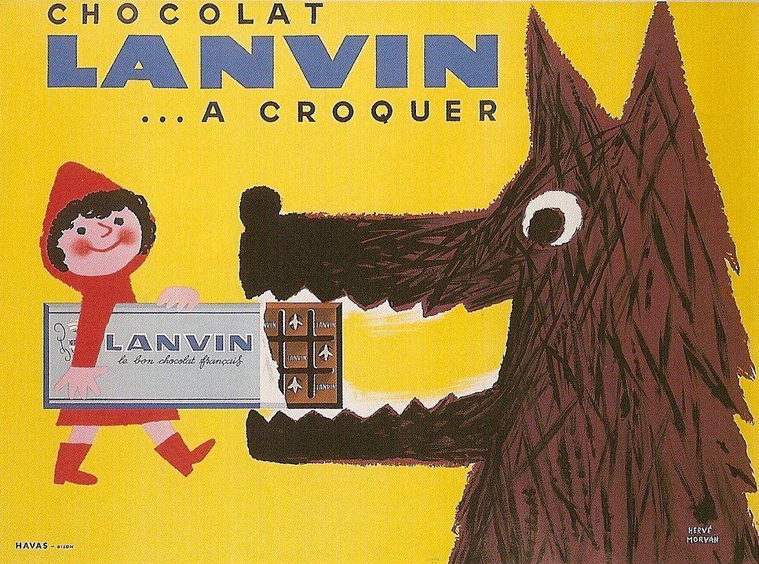 Advertising poster for Chocolat Lanvin, Hervé Morvan. 1950
Hello! I’m a learner.
So if you find mistakes, font analysis that seems wrong → email me.
Sources:
Bibliothèque Nationale de France – 1 – 2 – 3
University of Florida Digital Collection – 1 – 2 – 3
Internet Archive
Common Crow Books
WorthPoint
Museu Nacional d’Art de Catalunya
Manuels anciens
Le cottage de Gladys
W.W. Denslow Blogspot
Le Chemin des Aiguilles
Le Bazar de Sophie
Soloillustratori
Le Figure dei Libri
Wikimedia
Paris Bibliothèques
Colnect
McBalson Palys’ blog
Pinterest